Key takeaways
- Complementary = opposite colours (purple-yellow, blue-orange) for punch
- Analogous = three neighbouring colours for a calm, expensive look
- Warm colours advance and shorten; cool colours recede and add depth
- Green is the free neutral; white is the great linker and lifter
- Hot borders read best in full sun; pastels glow in shade and dusk
- Limit any one border to two schemes maximum to avoid jumble
After 30 years at Staffordshire, three rules hold. Pick the scheme before you shop. Plant in groups, not singles. Let green and white do the linking.
How the garden colour wheel works
The colour wheel is a ring of 12 colours.
Three primaries sit evenly spaced: red, yellow and blue. Mix two primaries and you get a secondary: orange, green and purple. Fill the gaps with tertiaries like red-orange, yellow-green and blue-purple. That gives the full 12 segments most designers use.
Two relationships do most of the work in a garden:
- Opposite colours (across the wheel) contrast and intensify each other.
- Neighbouring colours (side by side) harmonise and flow.
You do not need a printed wheel in the garden. You need to remember which colour each plant sits near, and whether you want contrast or calm.
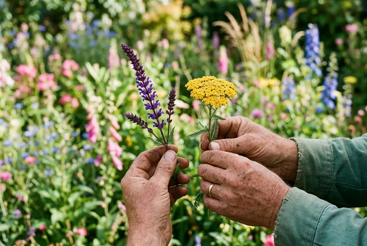 Comparing a purple salvia and a yellow achillea in hand before planting at Staffordshire. Holding two cut flowers together tells you instantly whether they contrast or harmonise.
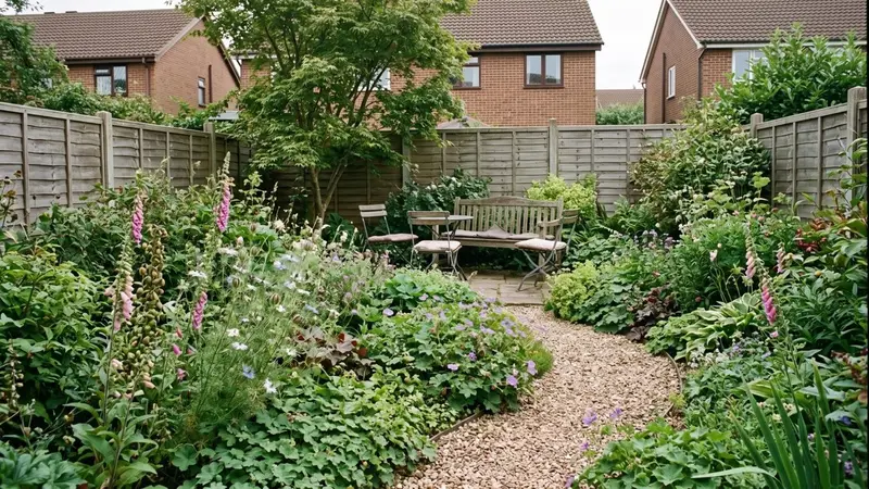
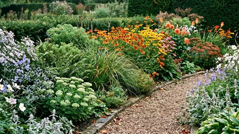
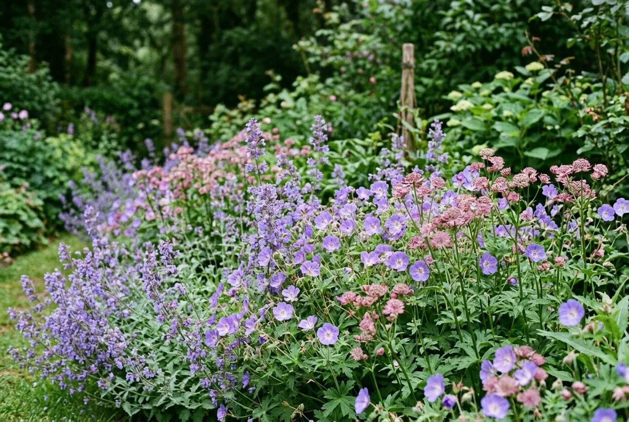 An analogous blue-purple-pink drift at Staffordshire in early July. Three neighbouring colours flow with no jarring contrast. This is the calm, settled look that suits a seating area.
Complementary schemes for maximum contrast
Complementary colours sit opposite on the wheel. Plant them together and each looks brighter.
The three big pairings for UK borders are purple with yellow, blue with orange, and red with green. Purple and yellow is the easiest to pull off because both colours are common in hardy perennials and they peak together in June and July.
| Scheme type | Wheel position | Example UK plants | Mood |
|---|---|---|---|
| Complementary | Purple + yellow | Salvia ‘Caradonna’ + Achillea ‘Gold Plate’ | Bold, sunny, high energy |
| Complementary | Blue + orange | Agapanthus + Crocosmia ‘Lucifer’ | Hot, vivid, late summer |
| Complementary | Red + green | Dahlia ‘Bishop of Llandaff’ + ferns | Dramatic, jewel-like |
| Analogous | Blue-purple-pink | Geranium ‘Rozanne’ + Nepeta + Astrantia | Calm, restful, expensive |
| Analogous | Red-orange-yellow | Helenium + Rudbeckia + Heliopsis | Warm, glowing, autumnal |
| Hot border | Red, orange, scarlet | Crocosmia, Dahlia, Canna | Vivid, tropical, full sun |
| Pastel border | Soft pink, mauve, cream | Astrantia, Penstemon, Erigeron | Gentle, hazy, dusk-friendly |
Use complementary schemes where you want a border to shout. A sunny front garden, the end of a path, or a single feature bed. Two complementary plants planted in bold groups will stop people in their tracks.
The risk is restlessness. Two strong opposites everywhere can tire the eye. Keep one colour dominant and use the other as the accent, roughly a 70:30 split, not 50:50.
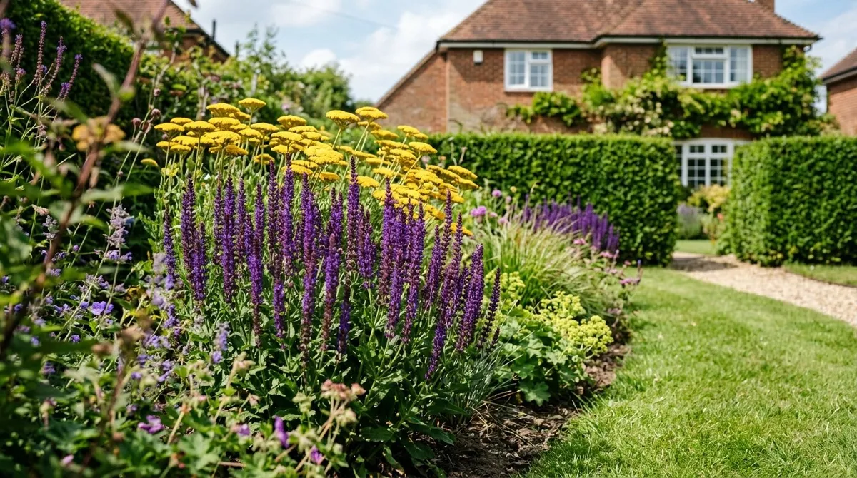
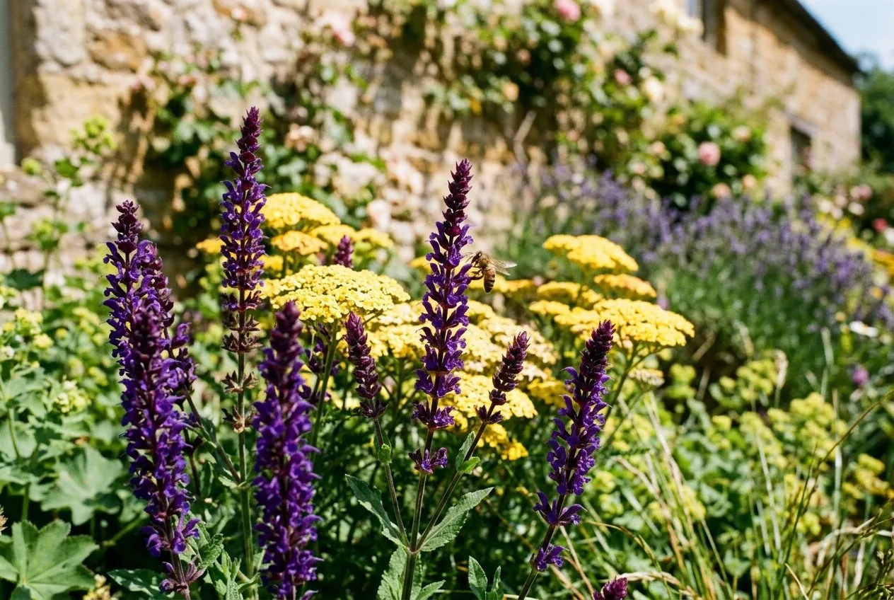 Purple Salvia ‘Caradonna’ against yellow Achillea ‘Gold Plate’ in a Staffordshire cottage border. Opposite colours make each other glow. A 70:30 ratio keeps it bold without tipping into restless.
Analogous and harmonious schemes for a calm border
Analogous schemes use three colours that sit next to each other on the wheel.
Blue, blue-purple and purple is the classic. So is red, red-orange and orange. Because the colours are close, nothing clashes and the border flows. This is the look that reads as expensive and considered.
Analogous borders suit:
- Seating areas where you sit and unwind
- Shady corners, where strong contrast looks harsh
- Small gardens, where calm makes the space feel larger
- Anywhere near the house you see every day
For ready-made trios that already work, our guide to the best plant combinations for UK borders lists pairings by season and soil.
Warm advances, cool recedes: using colour for depth
Warm colours come forward. Cool colours fall back. This is the single most useful trick in colour theory.
Red, orange and yellow advance toward the eye. Plant them at the far end of a garden and that end leaps forward, making the plot feel shorter. Blue, purple and soft mauve recede. Plant them at the bottom of the garden and the boundary seems to drift away, adding depth.
So the rule for a long, thin plot is simple. Hot colours near the house, cool colours far away. It stretches the view. For a wide, shallow plot you reverse the logic and use cool colours along the sides to push the fences back.
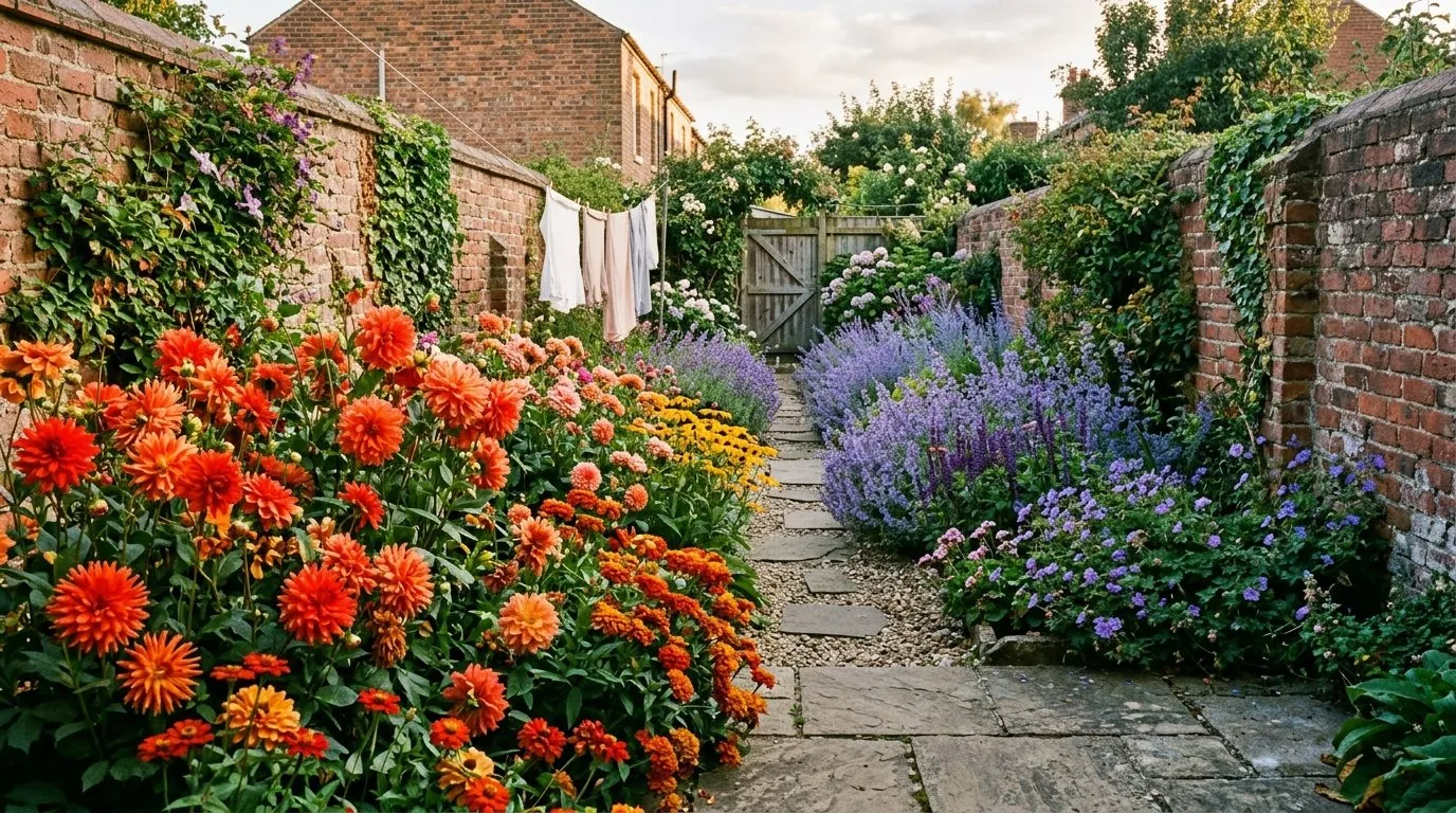
Hot borders versus pastel borders
A hot border and a pastel border use the same wheel but pull in opposite directions.
A hot border leans on the warm half: scarlet, orange, gold, deep red. Crocosmia ‘Lucifer’, Dahlia ‘Bishop of Llandaff’, Canna and Helenium. It needs full sun. In bright midday light hot colours sing, where pastels can look washed out and bleached.
A pastel border leans on the soft, cool half: powder blue, mauve, shell pink, cream. Astrantia, Penstemon ‘Sour Grapes’, Erigeron and pale Geranium. Pastels glow at dawn and dusk and in light shade. They are the better choice for an evening seating area because soft colours hold their light as the sun drops, while reds turn muddy and disappear.
Match the border to its light. Full sun and midday use, go hot. Shade, or a space you enjoy in the evening, go pastel. For a planting list built around the cool end of the wheel, see our purple, pink and blue flowers guide.
The quiet power of green and white
Green and white are the two colours that go with everything.
Green is free. It arrives with every leaf, hedge and lawn, and it is the natural backdrop the wheel was never drawn against. Green sits between warm and cool and calms any pairing. A border with strong green structure, from box, ferns, grasses or yew, will absorb colour combinations that would otherwise clash. Never plan colour without planning the green that frames it.
White is the great linker. Drop white flowers between two colours that fight and the white separates and settles them. White also lifts a dark, shady corner and glows at dusk when every other colour has faded to grey. A whole white-and-green scheme is the most restful border you can plant.
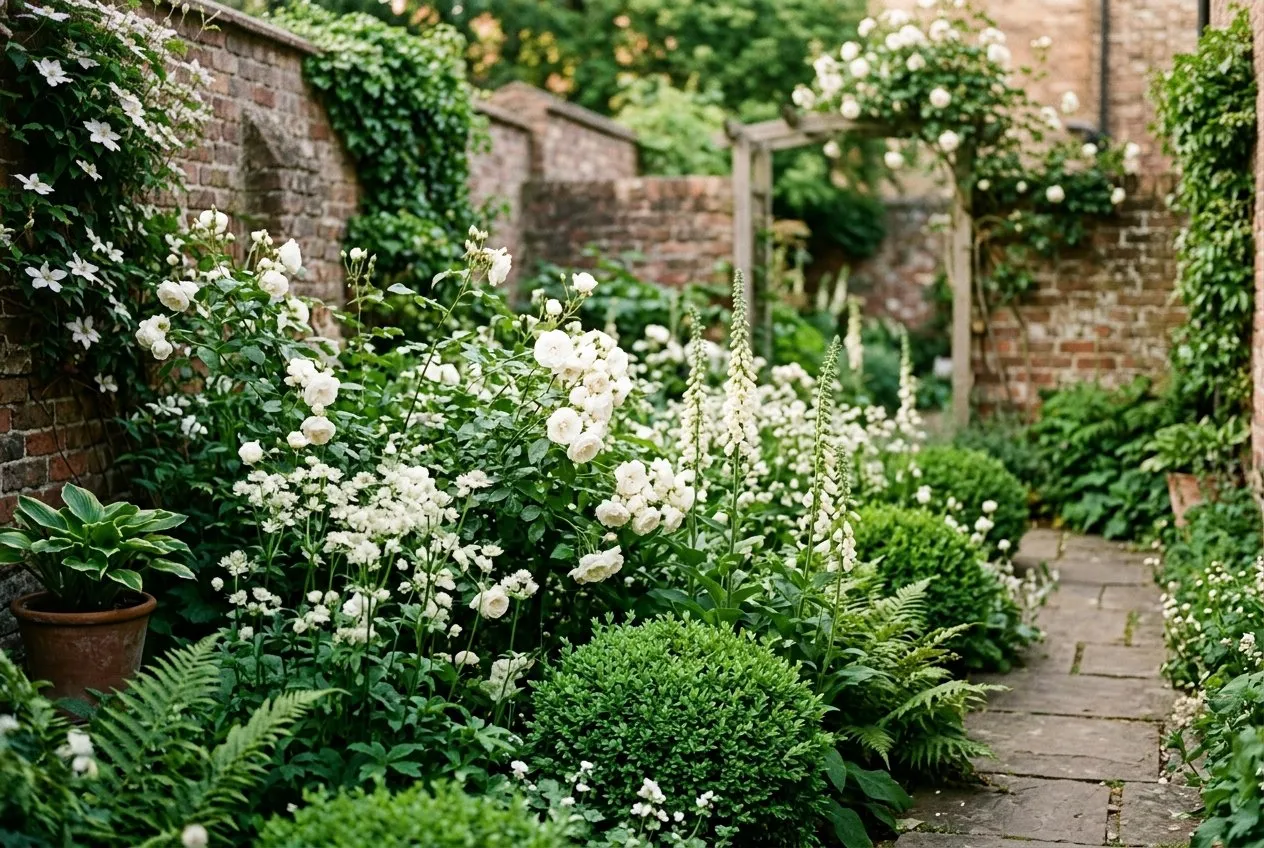 A white-and-green scheme in a small Staffordshire courtyard. White roses, Astrantia and cream foxgloves against clipped box. The calmest border you can plant, and it glows at dusk.
Putting a scheme together step by step
A workable scheme follows a simple order.
- Pick the wheel scheme: complementary for punch, analogous for calm.
- Decide hot or pastel based on the light and when you use the space.
- Place warm colours where you want the eye pulled forward, cool where you want depth.
- Plant green structure first as the frame.
- Add white as the linker and lifter.
- Buy in groups of three, five or seven and repeat each colour three times.
Cap any one border at two schemes maximum. A complementary feature at one end and an analogous drift at the other can work if green links them. Three or more schemes in one border is where order falls apart.
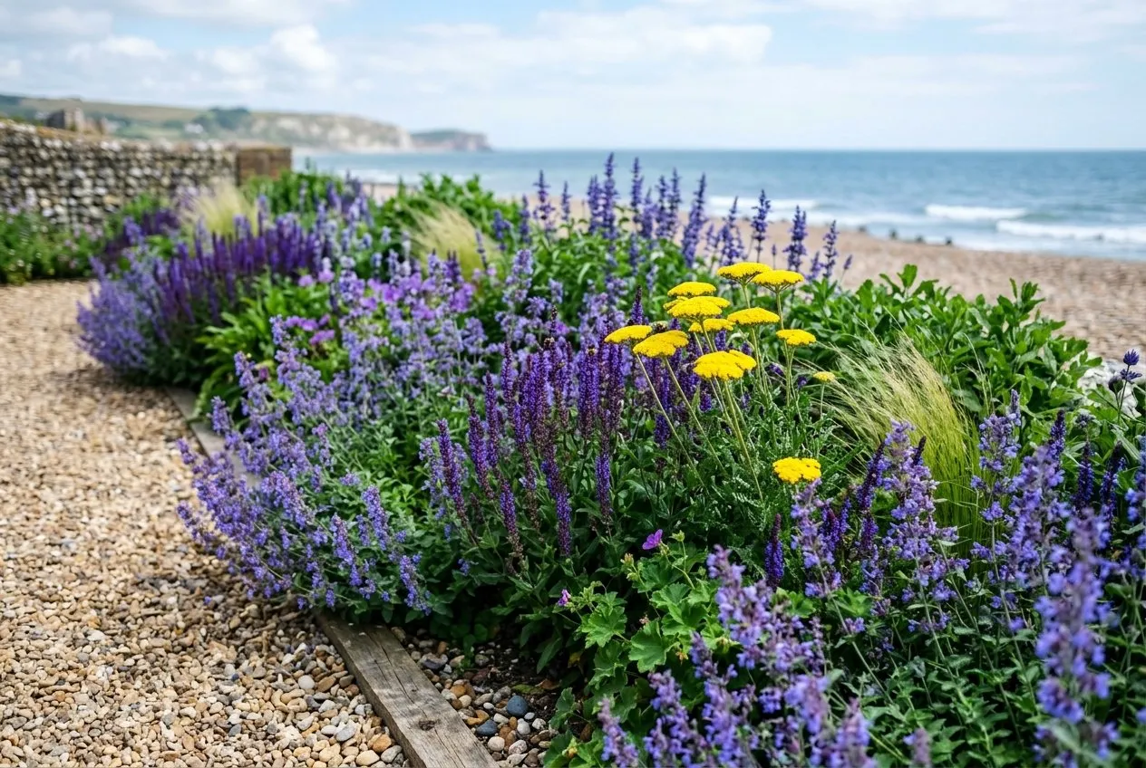 Two schemes in one Staffordshire-planted seaside border: a blue-purple analogous drift with a single yellow accent. Green foliage links them. Two schemes is the safe maximum for one run.
Frequently asked questions
What is the colour wheel in garden design?
It is a 12-segment ring of colours used to plan planting schemes. Three primaries (red, yellow, blue), three secondaries (orange, green, purple) and six in-between tertiaries. Colours opposite each other contrast; colours next to each other harmonise. Gardeners use it to choose flower pairings on purpose rather than by chance.
What is a complementary planting scheme?
Two colours opposite on the wheel, planted together for high contrast. Purple with yellow, blue with orange, red with green. The pairing makes both colours look brighter. Use it where you want a border to grab attention, such as a sunny front garden or the far end of a long view.
What is an analogous colour scheme?
Three colours sitting next to each other on the wheel, like blue, blue-purple and purple. It gives a calm, harmonious border with no jarring contrast. Analogous schemes look expensive and restful. They suit shady spots, seating areas and any garden where you want a settled, flowing feel rather than punch.
Why do warm colours look closer than cool ones?
Warm colours advance toward the eye and cool colours recede from it. Red, orange and yellow pull a far border forward and make a long garden feel shorter. Blue and purple drift back and add a sense of distance. Plant hot colours near the house and cool ones at the bottom to stretch a plot.
What colours go with everything in a border?
Green and white go with every scheme. Green is the natural backdrop from foliage and links any colours you plant. White lightens dark corners, glows at dusk and calms two colours that clash. A border with plenty of green structure and a few white flowers will absorb almost any colour mistake.
Now plan your borders on the wheel
Our team produces practical UK gardening guidance from source research, contributor records and established horticultural practice. Editorial standards are overseen by Matt W.